Max Protein
Rebranding a Protein Bar into a Power Snack

Overview
Max Protein, a market leader in the Indian protein bar segment, had built a loyal following among fitness-focused male consumers.
However, the brand wanted to move beyond its gym-only perception and tap into a wider health-conscious audience that included everyday snackers, working professionals, and women seeking functional nutrition.

Objective
Max Protein approached ting with a clear ask: Reimagine the packaging and identity to make the brand more inclusive, aspirational, and accessible - without losing its authority in the fitness space.
Challenges

Perception Barrier
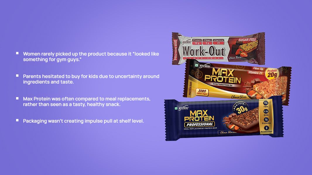
Women rarely picked up the product because it “looked like something for gym guys.”

Category Confusion
There was hesitation among women and casual snackers who associated protein bars with weightlifting and extreme fitness.

Weak Shelf Impact
The packaging looked technical, dense, and lacked flavour appeal—creating skepticism around taste and ingredients.
Insights Before Every Design Move
Before jumping into design, ting hit the ground—literally.
The team conducted extensive store visits across general trade, modern trade, and wellness stores, interacting directly with shopkeepers and on-floor staff to observe how Max Protein was being displayed, talked about, and purchased.
More importantly, we spoke with the people who know consumer behaviour best: the retailers themselves.
A Shelf-Ready Transformation Across the Entire Product Line
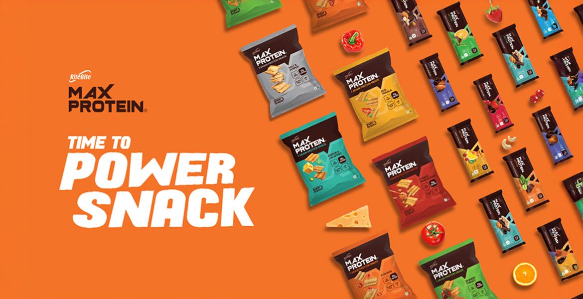
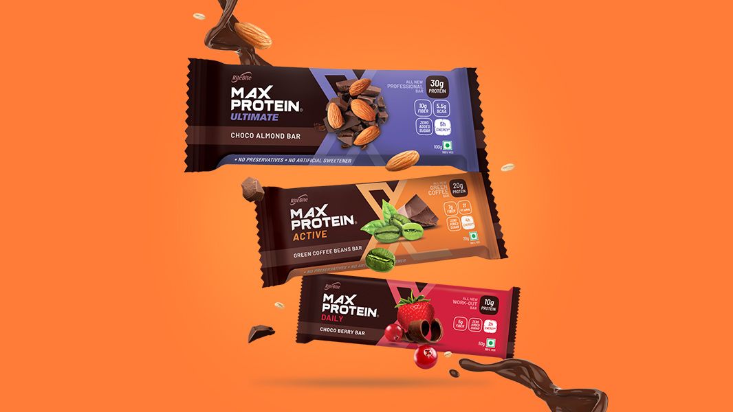
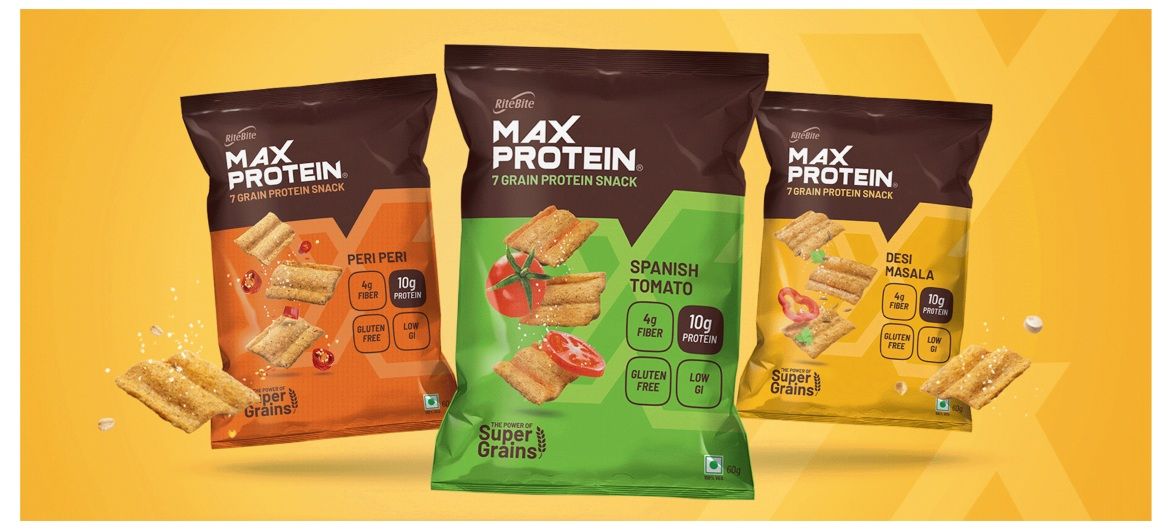
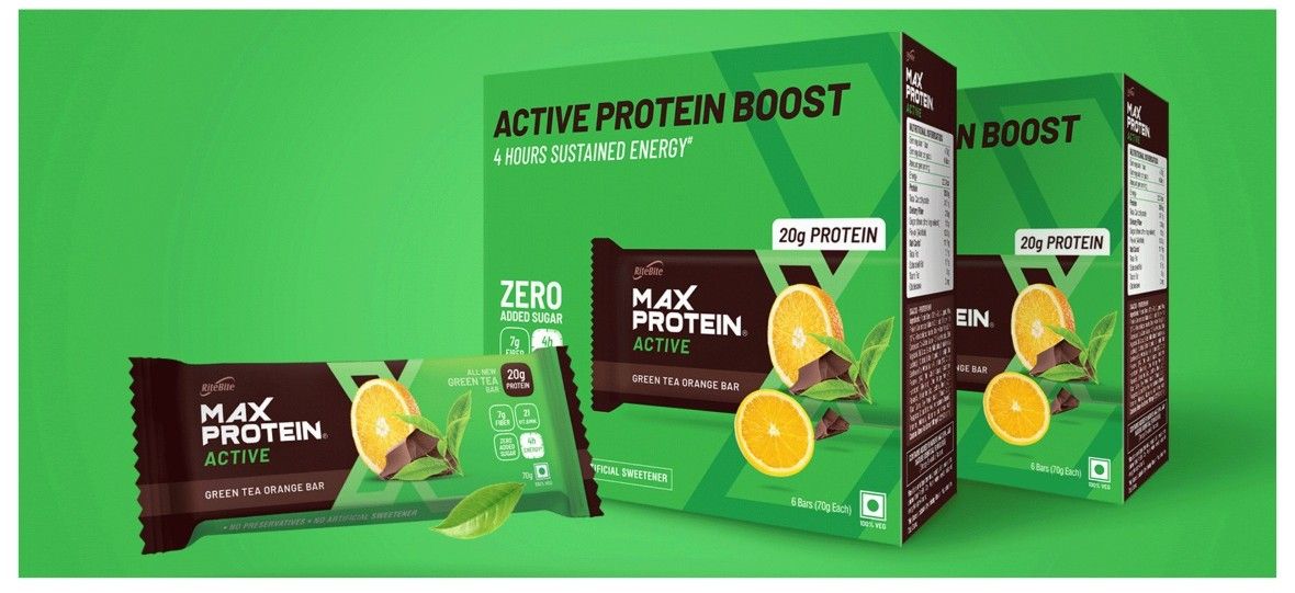
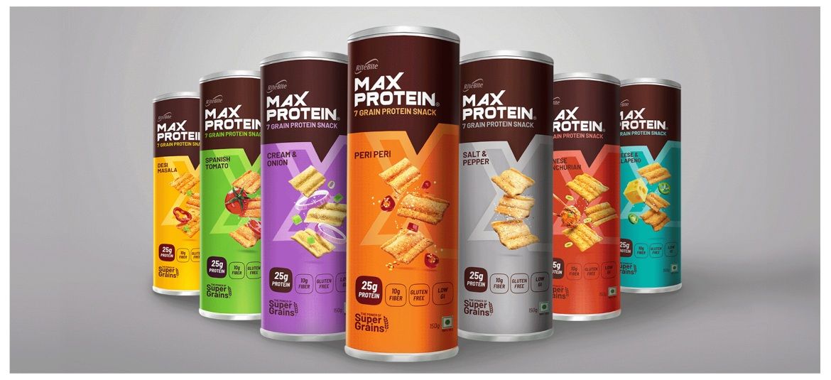
The result of ting’s rebranding effort was a visually unified, strategically repositioned Max Protein portfolio that now speaks to modern health-conscious consumers across genders and age groups.
From protein chips and meal bars to cookies and snackable packs, each SKU was redesigned with a fresh visual hierarchy, vibrant flavour coding, and clean iconography that made benefits easy to spot and hard to ignore.
Packaging was no longer bulky or intimidating—it was bright, bold, and balanced, combining nutrition cues with snack appeal.
This wasn’t just a design refresh—it was a brand overhaul, rooted in deep consumer insights and executed across every touchpoint by ting.
Worth a right swipe...
Like our work? Give us a little ting.


